Recipe
- Prep Time: 15 minutes
- Cook Time: 11 minutes
- Servings: 20 cookies
Ingredients
For the Cookies:
- 1/2 cup softened, unsalted butter (114g)
- 1 cup sugar (200g)
- 1 tsp baking powder
- 1/8 tsp baking soda
- 1/2 tsp salt
- 2 eggs
- 2 cups flour (260g)
- 2 tbsp matcha
For Rolling:
- 1/4 cup granulated sugar (50g)
- 1/2 cup powdered sugar (50g)
Instructions
- Preheat your oven to 350 degrees and line a baking sheet with parchment paper.
- Cream room temperature butter with sugar, baking powder, baking soda, and salt.
- Add in eggs and mix until homogenous.
- Sift matcha into your flour and pour into your mixing bowl, slowly mixing until all ingredients are incorporated.
- Using a cookie scoop, scoop 1.5 tbsp balls of dough.
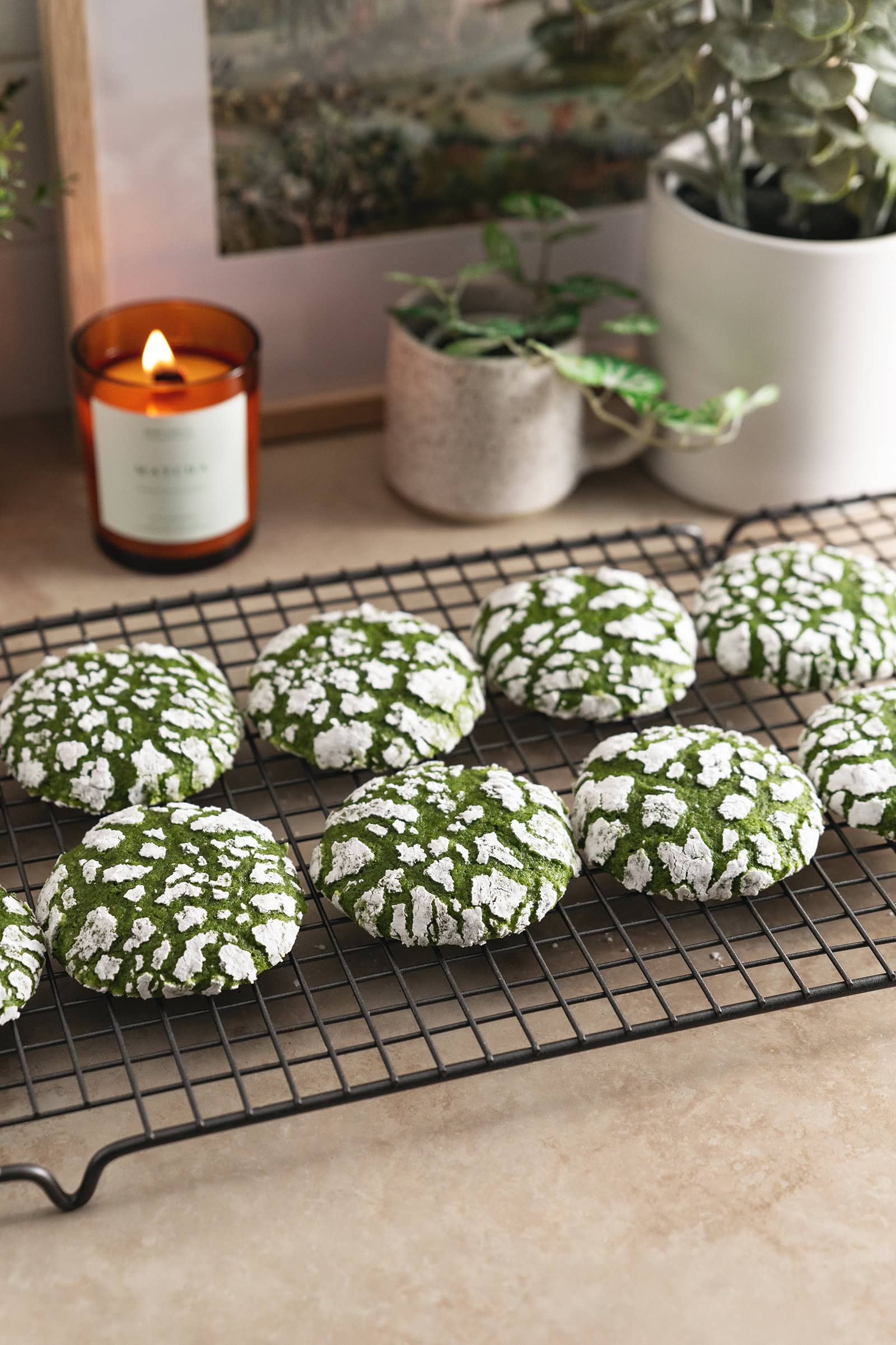
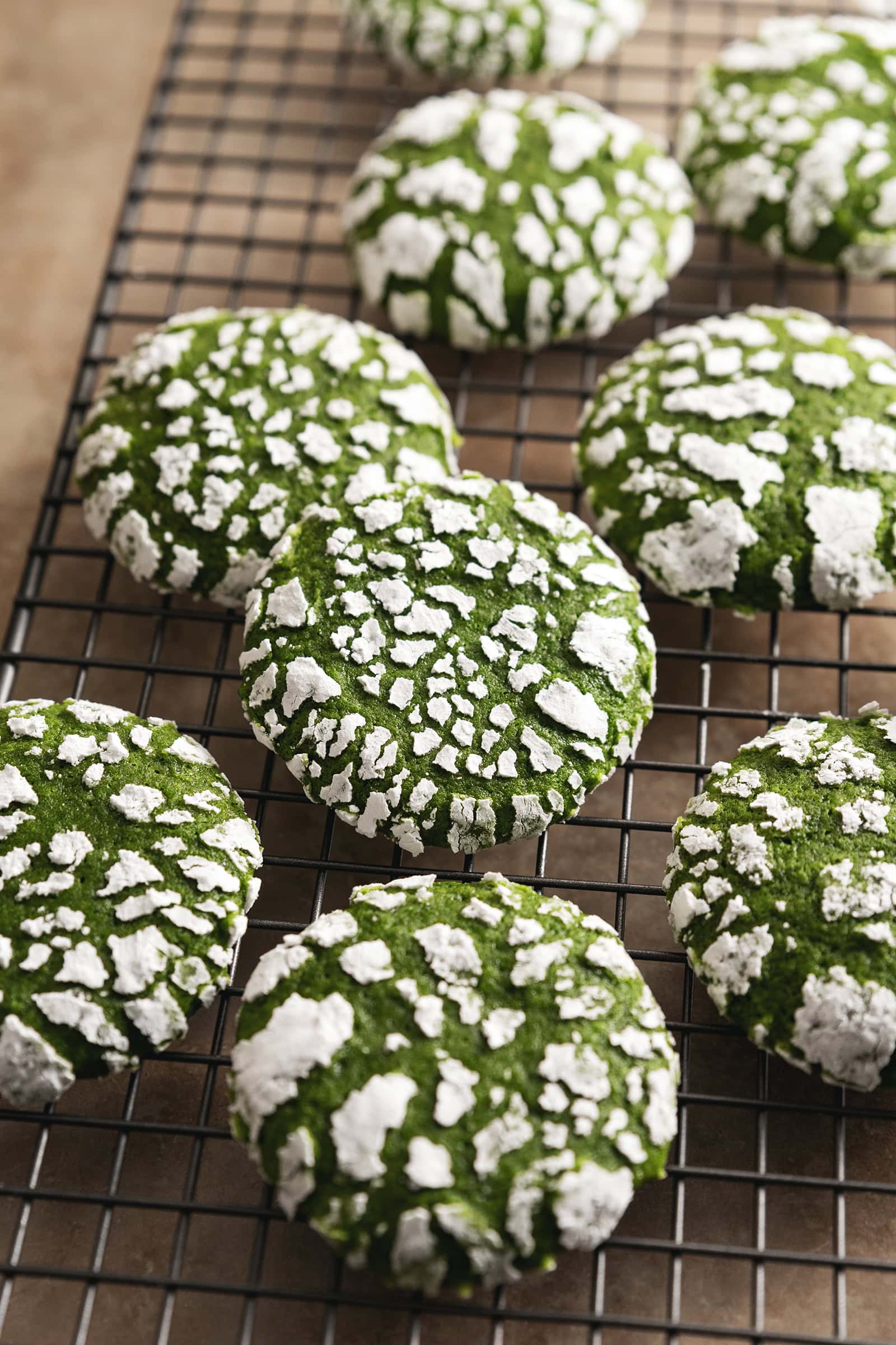
- Roll the balls in the granulated sugar, then the powdered sugar.
- Place on your baking sheet and bake for 11 minutes.
Notes
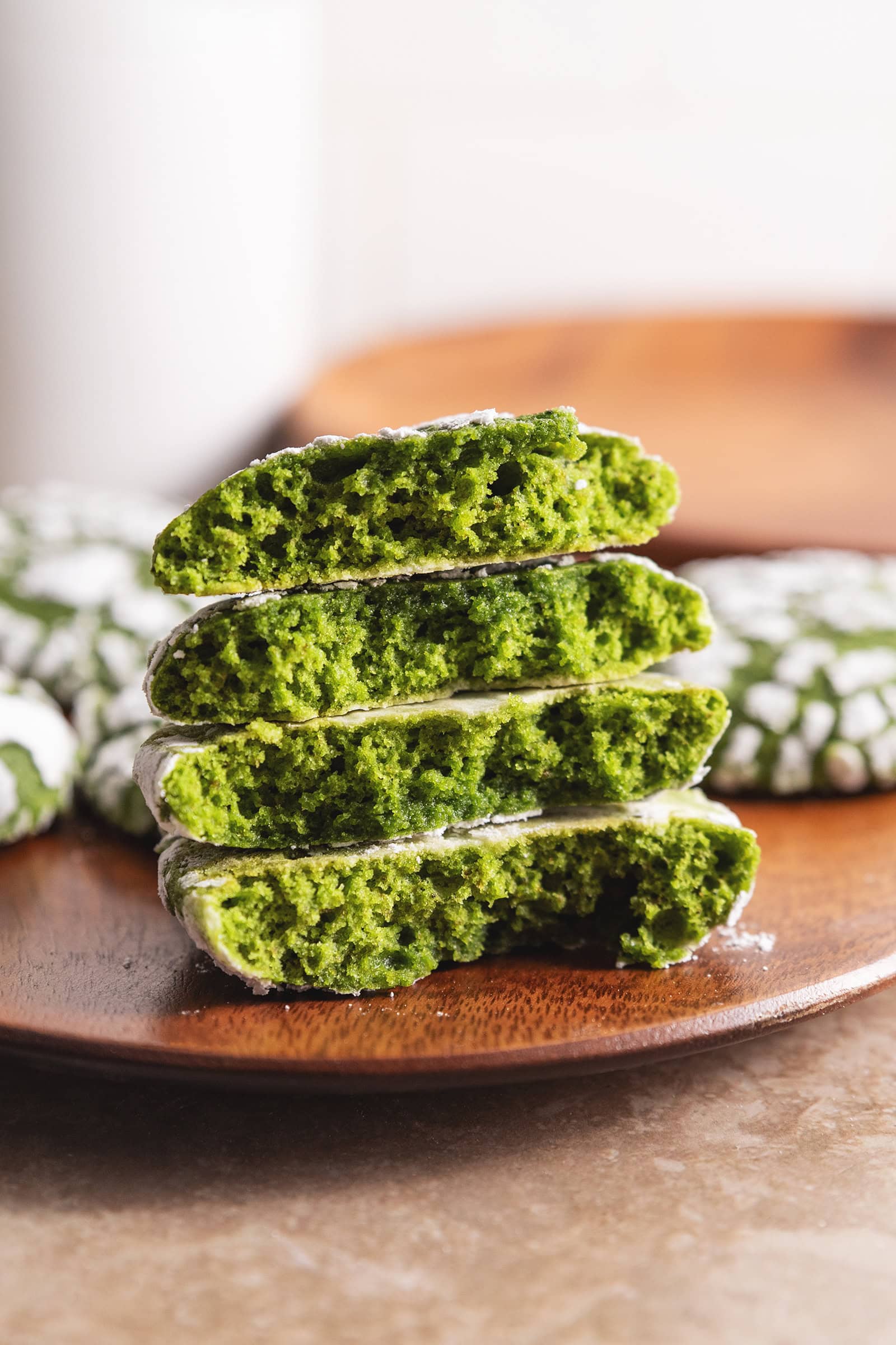
- Use a good quality matcha powder. Although culinary-grade matcha is marketed for baking, I always use ceremonial-grade matcha powder. It produces the best flavour and vibrant green colour compared to the brown-ish colour of culinary-grade or lower quality matcha. I know high-quality matcha powder is expensive and we're using a lot of it so try to use one that's more affordable and save your best stuff for drinking only.
- Roll the cookie dough in both granulated sugar and powdered sugar. The first layer of granulated sugar absorbs any excess moisture on the dough so that the powdered sugar layer stays bright white after baking. You need both!
Tips for better "No Chill" results
Most crinkle cookie recipes call for chilling the dough because it’s so sticky and soft. Chilling the cookie dough makes the dough easier to work with. This matcha crinkle cookie recipe does fine without chilling, but there are a few tips and tricks that will help.
- When you cream the butter and sugar, cream the baking soda and baking powder with it. There's a science behind this, but main point is that the cookies end up more evenly puffed up when you cream the leaveners with the butter and sugar. No flat cookies for this recipe.
- Use a cookie scoop! It evenly portions out every cookie dough ball, meaning less time the dough stays in my warm little hands, potentially melting all the hard work I put into aerating my butter.
- Keep your kitchen cool. If you’re baking in a hot, 80-degree kitchen, I’m not sure you’re going to have any choice but to stick that dough in the fridge. You know your baking conditions the best, so you do you.
Sample Imagery
Images from Teak and Thyme
Process images from Mochi Mommy


References
Recipe Websites
Allrecipes
This is a very simple, recipe only page that goes straight into the recipe with the cooking time and amount of servings, then the ingredients and instructions. Though I do like the personal notes of the food blog recipe websites, it's sometimes nice to just see the recipe itself first. It is also very helpful that there are process photos in the instructions to provide visual support.
The Recipe Critic
I like that it clearly states the important information at the top and makes the "Jump to Recipe" button stand out. A lot of the food bloggy recipe websites have those buttons as well but it's sometimes hard to see, so this clear header is nice. The other parts of the website aren't as great because of the larger font size and images + a wide side column of ads that makes you have to scroll a lot to read the whole page.
The Kitchn
The overall layout and design of the page is more minimalistic and easy on the eyes compared to the other recipe websites, which I prefer. I thought it was cool how the buttons on the left column stay on the screen as you scroll, which could also be useful for having quick links to different sections of the recipe.
Non-Recipe Websites
Chamberlain Coffee
I really like the effect of the cup getting filled with matcha as you scroll, and the "Behind the matcha" section also has a similar scroll effect with images and text on either side, which I think could be cool for the recipe instructions. I just also love the overall aesthetic of the website with the color scheme, fonts, and little illustrations.
Ffern
The two column layout could be utilized to have the recipe details and ingredients (and maybe tips?) in one column and then the actual page with instructions in the other column. Since the right main column is pretty long, I like that as you scroll, the header stays at the top until you hit the next section. It might be better if all the headers stack at the top so that you can click back to any section from the bottom. I also like the feature where you can click on each ingredient to see more information, which could be nice for putting additional notes for an ingredient.
Tony's Chocolonely
I like the playfulness of the website, from its design choices to the phrases they use. The font sizes and colors are very bold and have high contrast with each other, but it isn't overly done and still easy to read and navigate. For the customization section, I thought it was interesting how the background color changes as you move through the different wrapper options. All the hover effects on the images are also interesting, such as the wrapper peeling and the image tilting.